Wednesday, February 19, 2014
Yearbooks
I know that yearbooks have themes. They also have pictures from the school year. I know that you have to use photoshop to make the pages. Yearbooks take a lot of work and patience. You have to take a bunch of pictures and you have to interview people to be in the yearbook.

Wednesday, February 12, 2014
Photoshop Introduction
1. The Adobe Bridge, The Adobe Camera Raw, and PhotoShop
2. Photographers, Print, WebDesign, Video 3D artist
3. The Crop Tool is to cut out a picture at the Length you want
4. The lasso tool is to select a specific part of the picture
5. The text tool allows you to add words to the picture
6. Press "Command" and "Z" to undo something
7. Undoing any mistake you have to pull up the History Pallet
8. To rotate an image you must go to image menu and select "Image Rotation"
9. You may cancel your crop by using the "Cancel Icon"
10. You are telling photoshop which dimensions the image should be, because after you crop you will be forced into some ratios
2. Photographers, Print, WebDesign, Video 3D artist
3. The Crop Tool is to cut out a picture at the Length you want
4. The lasso tool is to select a specific part of the picture
5. The text tool allows you to add words to the picture
6. Press "Command" and "Z" to undo something
7. Undoing any mistake you have to pull up the History Pallet
8. To rotate an image you must go to image menu and select "Image Rotation"
9. You may cancel your crop by using the "Cancel Icon"
10. You are telling photoshop which dimensions the image should be, because after you crop you will be forced into some ratios
Monday, February 10, 2014

Friday, January 31, 2014
Magazine Covers
Early Magazine:

This looks really old. It is wrinkled. It is black and white. It has no color or affection to me. It is boring, and old, and tiring.
The Poster Cover:

This magazine has color and it also has a famous person. The font is really fun. The barcode is in the middle which is really weird.
Pictures Married to Type:

This one also has color. It has a design that makes the reader want to read the magazine. The font of the magazine is boring to me.
In the Forest:

This one is very complicated. It has lots of color, and sidebars. This is the newest magazine. People really like it because the picture and colors.
Name of my Magazine: "Potato Time"
CoverLines: "The Perfect Potato Comes in Many Shades of Brown"
Pricing: $4.50... Barcode would be the shape of a potato
Wednesday, January 29, 2014
Magazine Essential Parts
Masthead: The title and logo of the magazine
DateLine: The date the magazine was out
Main Image: The main picture on the front of the magazine
Model Credit: The signature of the person in the magazine
Coverlines: A short text to below below the picture to identify the photographers
Left Third: Where the barcode is located
Barcode: an optical readable represent ion of data relating to the object
Selling Line: The date when the magazine would go for sale
DateLine: The date the magazine was out
Main Image: The main picture on the front of the magazine
Model Credit: The signature of the person in the magazine
Coverlines: A short text to below below the picture to identify the photographers
Left Third: Where the barcode is located
Barcode: an optical readable represent ion of data relating to the object
Selling Line: The date when the magazine would go for sale
Monday, January 27, 2014


Tuesday, January 14, 2014
Fixed Portrait Shoot Submission
ISO 100

ISO 400
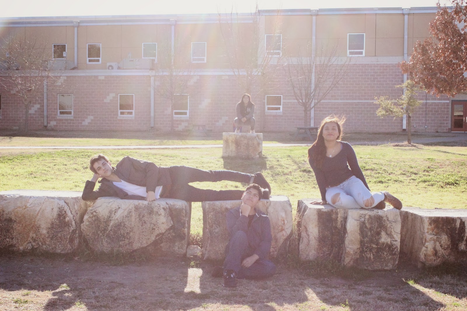
ISO 800

ISO 1600

ISO 3200
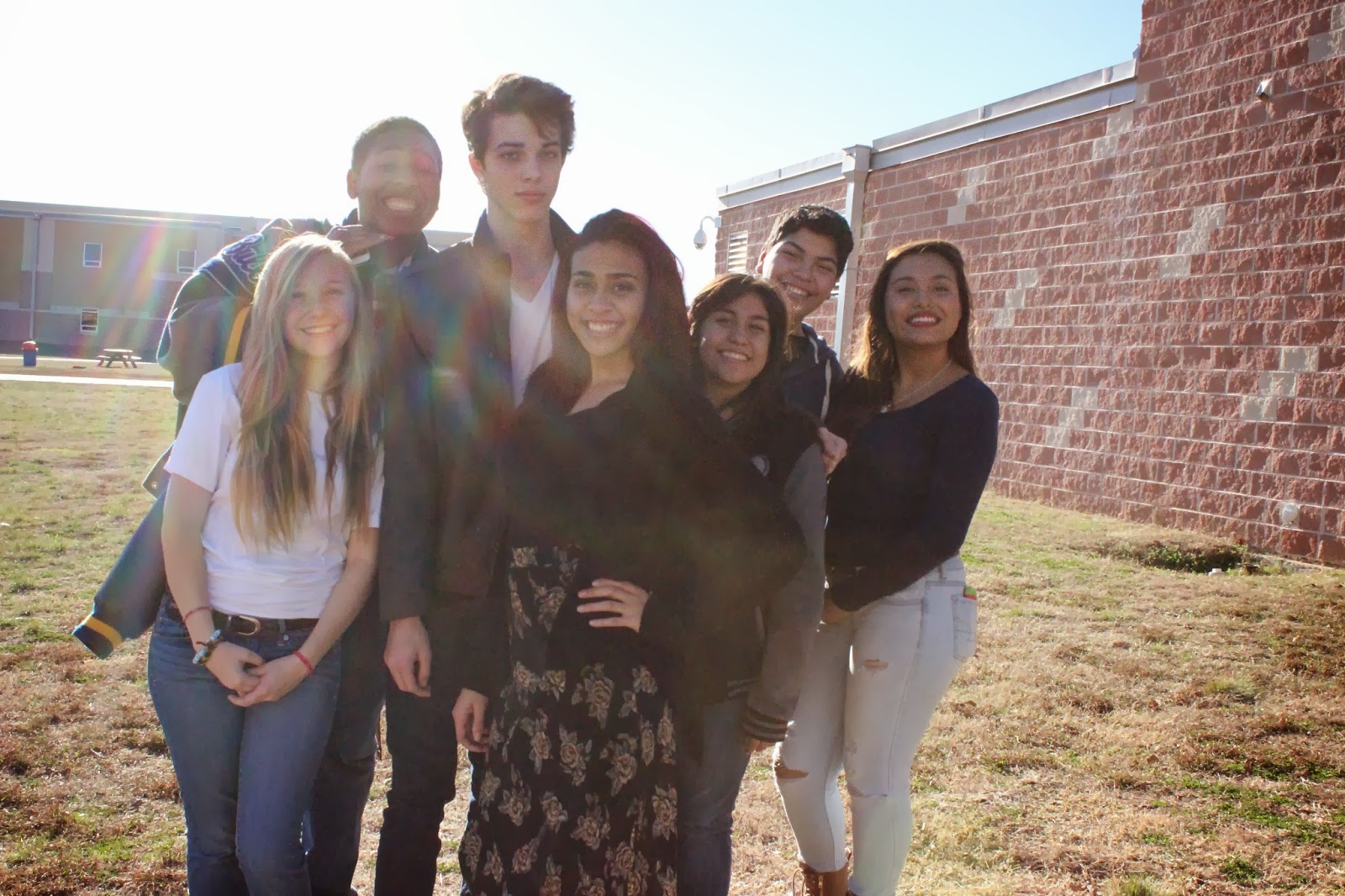
1) The best ISO setting to use for portraits is 3200.
2) My best picture is the first picture shown. I really like how everyone is spread out. And I think the picture is really cool.
3) Yes I was able to create equivalent exposures to the best photo by changing the aperture and shutter speed.
4) I learned that some ISO's are good and others are bad. I learned that it is good to use high shutter speed when you need to use so.
Subscribe to:
Posts (Atom)